Customers using a mobile phone website to access information about a service-based business like accountants, hairdressers or car pick up, need a different mobile web design to those accessing an eCommerce store. They are typically online for a shorter time and aiming only to gain a certain amount of information about your business before taking the next step to engage you. That’s why, when you create a mobile website for a services business, it must be based on our general principals for great mobile design as well some specific elements related only to service-seeking customers.
Here we unpack our 8 tips for optimizing your mobile website design for your service-based business.
- Get personal
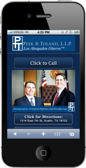
In a service based business you (and your staff) are the product! Put your faces on the mobile site to create a feeling of connection and personalisation with your customer as soon as they arrive on your site. - Phone number and Email
The two most important elements of information to a person looking at a mobile web design is how to contact you. We already know that they’re not going to buy anything off your site. That means that the number one activity you want them to do is to contact you. Make mobile website navigation easy by clearly displaying your phone number and email address on the first landing page. - Location
Customers of service-based businesses, especially those where clients arrive regularly for appointments like hairdressers or nail salons, are typically looking for your contact number or your location. Make your location easy to find by providing the address integrating with their local Maps application. This will give them directions right from where they are to where you are with just the click of a button.
The below website shows all three of the above elements used in the first screenshot of the landing page very well.
- Prioritise The Information You Need To Give
While you may want to jump in and ensure the customer has every option they might need on the first screen shot, this is just a great way to confuse them. Prioritize the information you give them into groups of three; the first three most important are already listed for you above. The next three sets of information – menus, information about the company or pricing lists – can be a screen scroll down. This allows the browser to digest sets of information at one time. - Break Down The Information About Your Services
Consider your services your products. Don’t provide a long list of paragraphs going into lots of detail about each service upfront. Break your services into headlines, summaries and detail and ensure only the headlines with a reference image are placed higher than the second level of a mobile website design. If you have too many products and loading time is slow, consider cutting it down to just the major ones you offer. You could also split it into categories, although remember that the less ‘levels’ you need the better. - Differentiate with Symbols, Icons and Colours
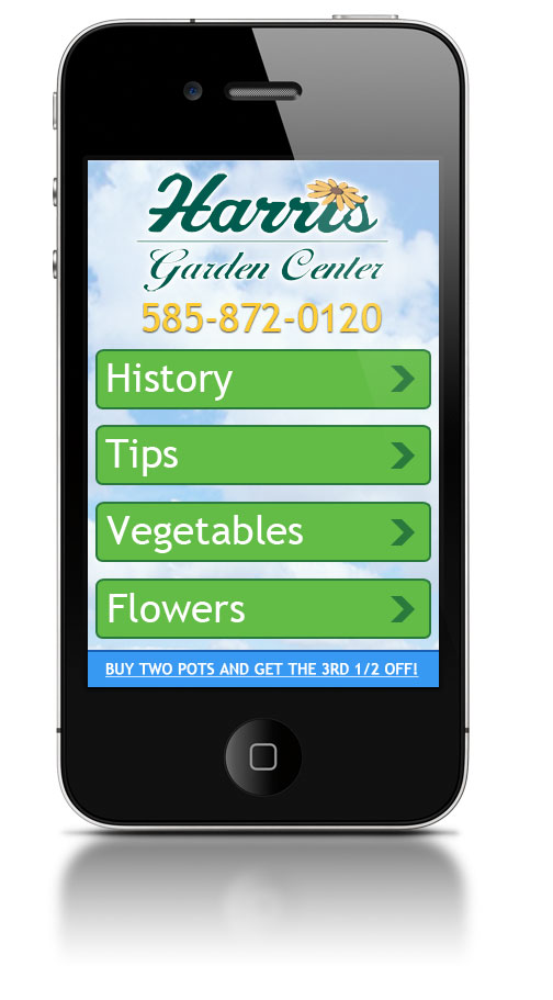
The below mobile website design only uses different symbols for four of its icons and sticks to a two-colour palate. While it might be a nice design, the information most important to a customer is lost amongst other information that is not so important. Use symbols, differing colours and icons to separate out the information you are providing with more than just words.
- Background Information
As a service business, customers are usually far more interested in who you are than they would be for a product sales business. Ensure you include a significant amount of information about who you are even if it’s the last icon at the end of a page. Talk about the history of the business and the people involved.
- Reduce Your Text Where Possible
While service based businesses don’t rely on pictures as much as ecommerce stores, you still need to keep the site interesting and navigable. This is best done with basic and simple pictures that relate to the subject matter you’re talking about. There’s no need to make the pictures large; 1/3 of the column width is fine.
For more information about how to design a mobile website to your specific target market, contact the experts; Complete cloud.
 Live Chat
  Contact Us
  02 8073 4699