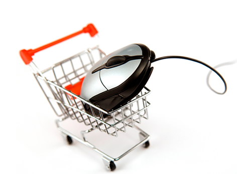
Developing a full suite of eCommerce solutions is vital to the success of your online marketing strategy. If you’ve already done the work required to open an online store and decided it’s time to create a mobile website, you need to ensure your mobile website design connects to your customers and encourages them to interact with your online store software in the way you want them to.
There are general best practice rules for all mobile websites (outlined in our previous article here). However, if you’re an online eCommerce store, you need to ensure your mobile website design contains the elements vital to your customers finding the product they want so they can buy it. Here are our top 13 tips to design a mobile website for an ecommerce online web store.
- Connect online web store accounts with your Mobile Site
When customers login using your mobile web store they expect to be able to use the same account as they would with your regular website. Your accounts management system must be the same for both your mobile site and your online store.
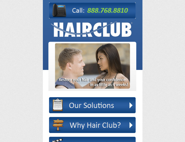
- Keep your phone number visible
Throughout the checkout process make sure that your phone number remains visible. That way a customer can call you for help without breaking out of the buying funnel. - Progress Indicators
To reduce frustration, include progress indicators at the top of your buying funnel. Once your customer has added a product to the cart, show them how many steps are left until they have actually bought the product. Of course, your goal should be to make the number of steps as minimal as possible - Provide Guest Checkout
Entering your full details to buy one product can be annoying on a desktop online store. It’s even more frustrating when you only have a tiny screen and big fat thumbs to type in the details. Make sure your ecommerce mobile website provides guest checkout options for new customers who aren’t signed up yet and don’t want to spend the time entering details. It’s better to forego their details for the sale than to lose both! - Connect the customer to your local store
If you have multiple stores, use geo-location services to ensure the information most easily available relates to the store they are closest to. This includes directions to the store and a contact phone number. - Add in a Search Box
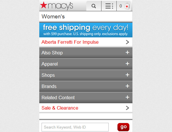
Searching for the product you want can be frustrating when there are lists of categories and only 2-3 products can fit per page. A search box at the top of the screen will help customers who know what they want find it immediately. - Use the same wording across both platforms
If a customer is going to use your search box to find a product, your product descriptions in your mobile website need to match those on your online ecommerce store. Ensure headlines at least contain the same keywords and description metrics like size and colour. - Optimise the number of products displayed per page
Play around with your page load up time on various connection speeds to find the optimal number of products that should be displayed per page. Too many and the page will take too long to load. Too little and your customer will need to wait for new page loads too frequently for efficient browsing. The ideal number of products is usually between 8-10 although it will depend on the quality of your pictures and the amount of text required for your products. - Reduce Clutter
Focus the customer on doing what they came to do – which is buying a product for you. While you may have extensive product inventory, videos and promotions splashing up on your online website store, this is too much for a mobile site. Pair it all down to your most popular products with one or two sale options.
- Use one bold text colour for stand out features
Differentiate your sales and other features you want to stand out by using a different text colour. While this looks a bit tacky on a desktop website, it works very well on a mobile site provided only a maximum of 3 colours are used in the design. Mobile website formatting must be simple to read. - Allow browsers to sort your products
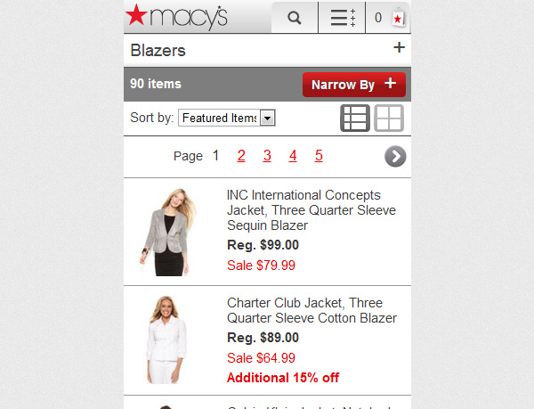
Don’t forget to put sort options at the top of your product pages. This will help customers find the product they want in a shorter amount of time. - 1/3 Picture, 2/3 Text/Price
How big your pictures should be vs the amount of text you put in will naturally depend on your product, however a good rule of thumb is 1/3 picture, 2/3 text. This gives enough space for the customer to get an idea of the product as they’re browsing. Of course, when they click to go deeper on a product for more information, ensure the picture takes up a full column.
If these design tips are new to you, your business will benefit from working with professionals like Complete Cloud to design a mobile website.
 Live Chat
  Contact Us
  02 8073 4699