So your boss has finally realised that mobile websites are the future and has asked you to create a mobile website… stat. Where to begin!? Here we outline the best of the best practices in the industry to get you on your way to an epic mobile web design that will impress both your boss and your customers!
Goals
- Goals
Before you start get clear about what you are trying to achieve. A mobile website design can’t do everything a standard desktop website can do. You’ll need to decide which functions are most important for your customers when they’re on the go. What do they want from your company if they’re using their phone to look you up? What actions do you want them to perform? Clarify the 3 activities you want your customers to perform (buy something, make a reservation, call for more information) as a result of using your mobile website. - Design for Conversions
Keeping your goals in mind, what is it that customers need to accomplish these goals? If you want them in your restaurant, eating your food, they’re going to need a menu, an address and a phone number. These steps to your goals will translate into your call to action buttons. Check out our previous article on designing effective call to action buttons when you set out to design a mobile website.Macy’s do a great job of prioritising the actions they want their customers to take. ‘SHOP NOW’, ‘FIND A STORE’ or ‘CHECK YOUR ACCOUNT’.
- Keep it simple:
Because of the small size of the mobile screen, simplicity is key when you design a mobile site. Continually ask yourself, ‘what do my customers really need?’ Create no more than 3 navigation layers – they need to be able to access all the information in just 2 clicks. - Design for the thumb
Think about drop down and search boxes – they’re so difficult to click on with a thumb. The same goes for hyperlinks in text. If you want someone to click on something ensure it’s a big button made for the size of a thumb. Anything less will frustrate the user and send them elsewhere.The Hairclub have simplified their mobile site so that it is easy to find the information most important to the customer.
- Design for visibility
Use big everything. This is why you need to keep the navigation simple; you need big content, big pictures and big buttons on a smaller screen! Make sure your text is easy to read and fits on the column of the mobile screen. There’s nothing more frustrating than scrolling sideways or squinting to understand what’s on the screen. - Crucial Element Priority
What’s the most important elements of your website? Put them upfront. Don’t try to be tricky with a fancy design and leave contact details or reservation booking buttons at the bottom where someone may not see it. - Quick Load time
Mobile websites are typically accessed over mobile data networks. While they are improving the speed connection is typically slower than a normal computer. Be careful that your website loading times are not unusually slow – another reason to keep the design simple and functional. - Redirect:
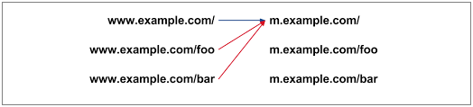
The below diagram is how to set up the links between your current desktop website and your new mobile website… the wrong way.Key pages on the main website all redirect only to the home page of the mobile website. This is frustrating for a person browsing and will actually reduce your ranking ability in Google search engines. Make sure that each of the pages of your desktop website link directly through to the relevant page of your mobile website.
- Get social
Don’t forget that mobiles are connected to social media platforms as well! A user can easily share their recent activity with their friends or discover your facebook page or twitter account at the click of a button. Remember to provide options allow users to share your site on their social media platforms. - Make it responsive
If users click on a link, make sure it changes colour so that they know they have clicked on it. This aides in navigation as it tells a user that they have previously visited a link and stops them from accidentally clicking on it again. It also gives a feel of deeper dimension to your mobile website design by giving the impression that the website button is 3D. - Brand
Amongst all the details, don’t forget about your brand. Keep your brand prominent and make sure users can see it. A simple header at the top of the page and a footer with your logo will be sufficient.1800flowers.com have their logo on the top left as a header. This means their logo is displayed on every page.
- Test and retest
Mobile devices come in many sizes and operating systems. A website can look totally different on a Samsung Android than it does on an iPhone. Test it on all types and don’t forget the tablets as well! - Include Analytics
The final step for success on any site is checking the analytics. Make sure you can see the metrics from your mobile website design separately to those of your main site. This way you can see what users are clicking on and continue to optimise your site for your audience.

Design

Functionality

Report & Improve
The easiest way to get the best mobile website for your business is to give the job to Complete Cloud. We’ll follow all the above steps and more, ensuring you maximum exposure to mobile audiences.
 Live Chat
  Contact Us
  02 8073 4699