Mobile websites are here to stay. In fact, they will soon become the platform of choice for most people searching for information and looking to buy products. There’s a lot of hype around transitioning to mobile websites and ensuring your website is mobile friendly but here we cut through all the clutter to bring you the 6 main things you need to know to ensure your mobile website reaches your customers when they need you.
1. Optimise Your Mobile Site For Search Engines
When someone conducts a search on a mobile device, Google is now penalising websites that do not have mobile-friendly versions. Your website needs to have a corresponding mobile web design that complements your existing structure and smooths the users experience. Ensure when you design a mobile website that you link each individual page to its corresponding mobile version.
2. Fast Load Time
When customers are on the go they don’t have the time to sit around waiting for pretty images to load. Focus on speed, speed, speed. Google also apparently penalises websites that take too long to load.
3. Simple and Clean Website Design
Typically, mobile platforms have much less space than a larger desktop, although with tablets some argue the difference is negligible. The key to operating in a smaller space is to keep your mobile web design uncluttered and straightforward. You may need to strip out some functionalities in order to achieve this. The key is to think carefully through which features your customers want when they are out and about, perhaps in a bus or at dinner with friends.
4. Choose your call to action buttons carefully
Part of ensuring your mobile site is easy to use is ensuring that call to action buttons are functional and the ones your customers need. Call to action buttons are the pinnacle of your sites success; getting the consumer what they need when they need it. For restuarants this will be directions, booking details or menus. For online stores this will be a product category list and shopping cart. If you’re a service provider, focus on providing your contact details and testimonies.
5. Design for action
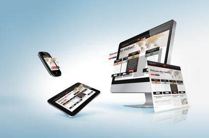
As you can see from the sites Complete Cloud designed for our customers below, mobile websites are less about browsing and more about action. People on the go need something and you are here to provide it. The buttons are large and easy to read and there are clear options for basic functionalities. This is not the space to be prioritising branding. Focus your website on function.
6. Test, test and test again
Ask someone to test your website. Ask three people to test your website. Get people you don’t know to use it. Offer random people in the street a chocolate bar for looking it up and giving you their feedback. You will be surprised at what you don’t know you don’t know about what customers want when they visit your website.
If you haven’t yet got a mobile website, there is nothing more important that you need to do for your online store right now. If you’ve been putting it off, use one of our mobile website designer experts today and reap the benefits of increased exposure to the mobile market today.
 Live Chat
  Contact Us
  02 8073 4699
Definitely believe that which you stated. Your favorite justification appeared to be on the internet the simplest
thing to be aware of. I say to you, I definitely get irked while people
consider worries that they just don’t know about. You managed to hit the nail upon the
top as well as defined out the whole thing without having side-effects , people could take a signal.
Will probably be back to get more. Thanks