We’ve previously outlined the 6 rules of creating a successful mobile website. Here we hone in specifically of the design of your site. Follow these design principals to ensure your mobile website design is successful.
- Don’t assume ‘fast and furious’ is the norm anymore
It used to be that when someone accessed information on their mobile, it was because they were in a rush and needed a particular type of information. That’s not the case anymore. More and more, mobile devices are being used as regular browsing devices when we’re sitting on the couch or waiting in the car or on the train. Design as much for detailed and in-depth information gathering as for ‘quick call to actions’. - Build your websites together
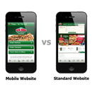
There are many companies offering ‘template designs’ to create a mobile website. It’s important to ensure that your mobile website’s content is similar to your regular website just targeted for a more streamlined mobile experience. It’s also important to ensure the mobile site’s look and feel, branding and logos are similar to your regular website. Create your mobile site to work cohesively with your regular website rather than a separate bespoke one that may look like a different company. - Core Content Should Be The Same
While the layout and depth of information might be different on a mobile, it’s important to maintain cohesiveness between your websites as well as adequate information for the browser so they are not required to click on ‘view desktop version’ for the functionality they want. Consider your mobile website simply a different skin to your desktop version. - Keep It Simple
The best designs keep the information a user wants at the forefront without clutter and overloading. Keep a balance between minimum amount of layers and reducing the necessary amount of scrolling. If you have sign up forms keep them minimal; email and name. Every additional hurdle your user has to jump over to access the information they need causes frustration. ] - Choose Your Devices
Mobile websites can be enhanced for the different mobile device platforms. Use website analytics to discover which platform your regular users are primarily using. This data will tell you the size of the screen and the version of operating system as well. Each platform has its own particular standard mode of operation its users are accustomed to. This means that you can’t just slap an iOS interface on for an Android. Customisation will get you better results. - Prototype and Test
You may draw up sketches or designs for each page as you make a mobile website but it’s time consuming. A mixture of sketches (also known as wireframes) along with a prototype that can be tested in the real world is the quickest way to confirm the best design. Use your website analytics to get feedback about how its working as well as face to face testing and trials.The world of design and technology will constantly be changing as people experiment with new ways of developing their products and websites. Embrace this and remember to review your website design periodically to ensure it fully exploits the potential of design and technology.
For updates join us at Google+
 Live Chat
  Contact Us
  02 8073 4699