
“Sign up”, “Download”, “Call us”, “Free Quote”, “Read More”
You will have read these words on a website before; without all their punctuation they look pretty ho-hum! The words of a Call to Action themselves are actually quite boring. If you want your visitors to do something while they’re at your website, it’s your Call to Action buttons that will push them into action!
What Are Call to Action Buttons?
A Call to Action button is simply a button that you see on different web pages, the purpose of which is to solicit an action from site visitors. These buttons, when clicked, either lead to another web page with additional information (e.g. Read more) or perform an action (e.g. Download)
After ensuring that your website design and content will attract the attention of your visitors, you need to get your website visitors clicking on your CTA buttons. Here are 6 tips for increasing your click-through rate.
How do you create effective Call to Action buttons?
- Put Your Call To Action button Above The Fold
- Bigger Call to Action buttons are better. Right?
Not really. Just look at this example: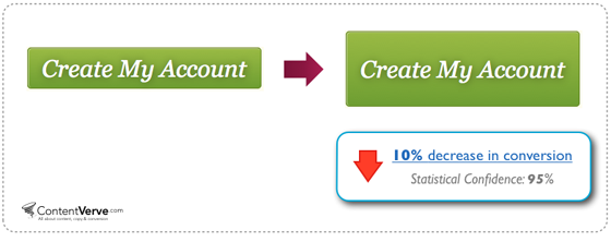
Image source: ContentVerve.com
When the button was enlarged, it became too big and may have made site visitors feel pressured to perform the action indicated on the button. It resulted in a 10% decrease in conversion.
Some CTA buttons are too small because some website design companies tend to squeeze a lot of content onto a page. As a result, CTA buttons are shrunk. This is a bad idea.
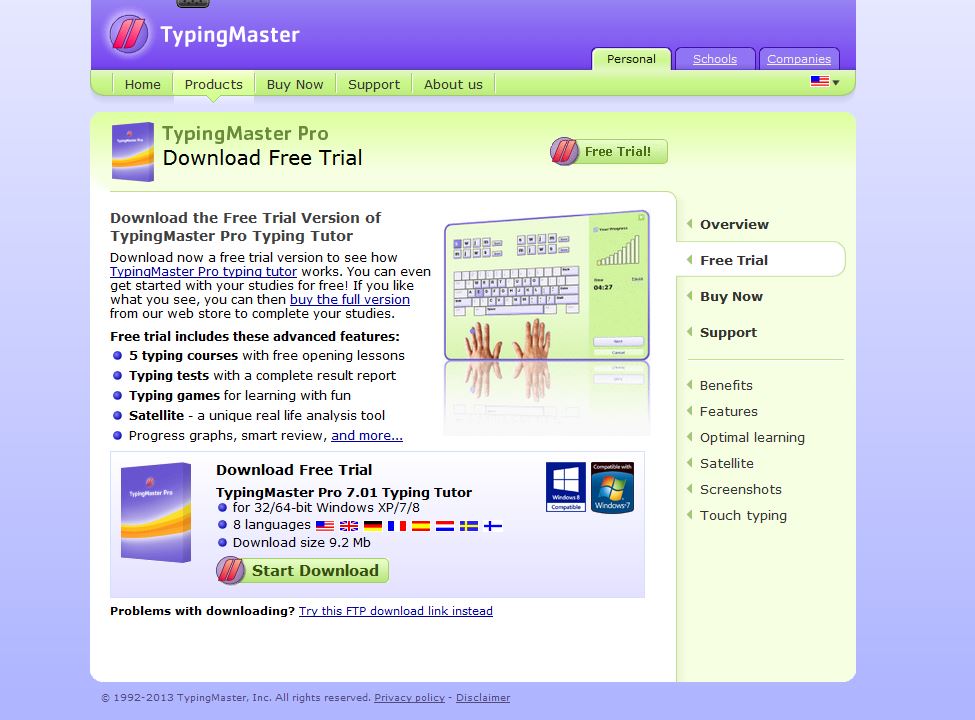
Image Source: TypingMaster.com
The best size for your CTA buttons is big enough that they stand out but not oversized.
- Choose a Colour That Makes It Stand Out
You need to experiment to find the right color. In the example below, putting the bright yellow CTA button on top of a grayscale image is very effective.
Image source: Powered by Search
It is quite obvious that the colour assists the CTA button to stand out more.
- Use Rounded Corners
Most CTA buttons are rectangular-shaped but rounded corners are better.
Image Source: Smashing MagazineRounded corners draw attention to the content inside the button while a square or rectangular one points outward. Studies have shown that people’s brains have been wired to avoid sharp edges because they present a possible threat. In addition, it takes less effort to see rounded rectangles. According to Professor Jurg Nanni, author of Visual Perception, “A rectangle with sharp edges takes a little bit more cognitive visible effort than for example an ellipse of the same size.”
- Write From The Reader’s Perspective
Apart from your headline, there is a 99% chance that your prospects will read your CTA copy.In one example, a website design firm just changed one word in the copy – from “ start your 30 day free trial” to “start my 30 day free trial.” After testing it for three weeks, the new treatment increased CTR by 90%:
- Do tests
Go through your site. Look at your Call to Action buttons. Do they stand out? Are they easy to recognise or do they blend into your business website design?Do the squint test and check if you need to change the colour of your CTA button or add a visual effect to make it “pop.”
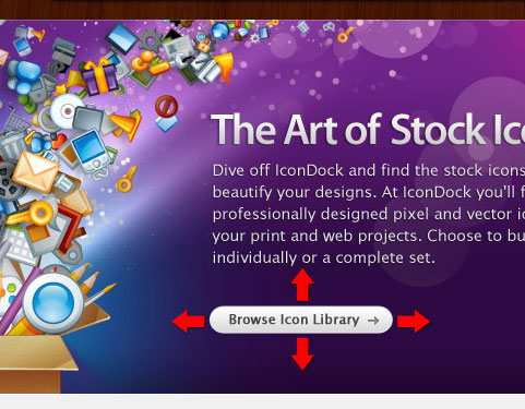
It is best to put your CTA button above the fold so that it’s the first thing your site visitors see before they have to start scrolling down in order to convert. IconDock is a very good example:
However, there are cases like the one below where putting the CTA button at the bottom of the landing page produced a 304% increase in conversions:
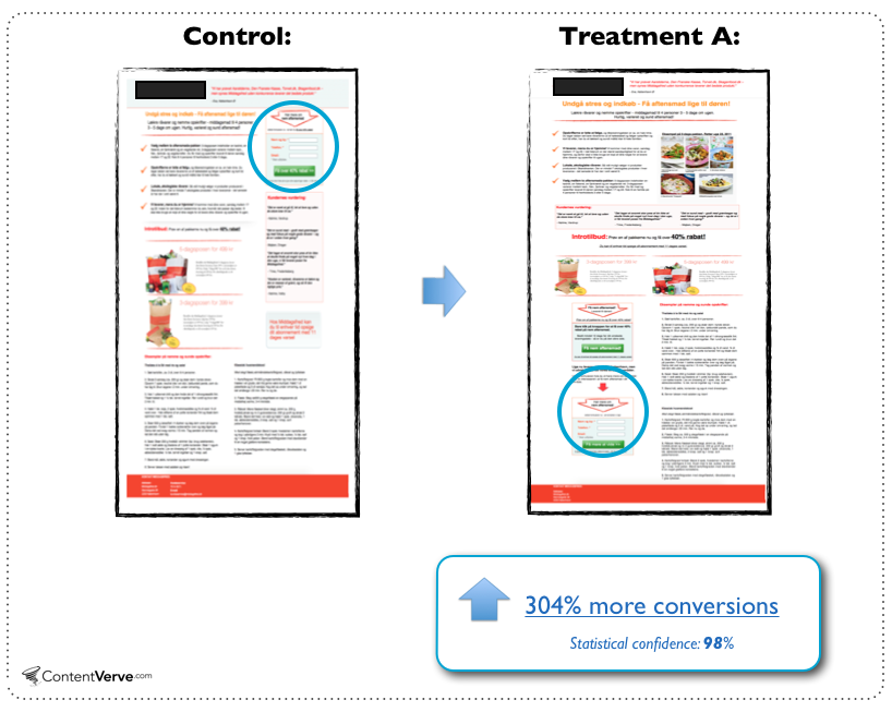
Image Source: ContentVerve.com
You can always put the CTA button in both places!
Ensure you use analytics to measure the effect changes to your CTA buttons have on your click-through rates.
Visitors to your site can’t go through your sign up form or check out process without clicking at least one Call to Action button. So, it is important to have CTA buttons that will convert in your business website design.
If you’re not sure how to do this, you can hire our experts in website design and development at Complete Cloud.
For updates join us at Google+