A desktop website has been designed to be viewed on a PC or laptop with sufficient space to display the website navigation and content. It has been optimised to be used on a larger screen with a mouse and keyboard.
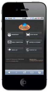
A mobile website has been designed to be used on a Smartphone with a much simpler navigation and content required for the Smartphone touch interface. Action buttons are also more prominent on a mobile website.
If people view a desktop website on a mobile device, they often get frustrated by the difficulty of using the navigation and reading the content as the and often don’t spend much time on your site.
Mobile websites are specifically designed to worked for users on the move that and need information quickly and easily. They also take advantage of mobile phone capabilities such as a click-to-call button which connects your customers to you quicker and easier.
 Live Chat
  Contact Us
  02 8073 4699